How to Apple Colors (part i)
Experimenting with gels and filters
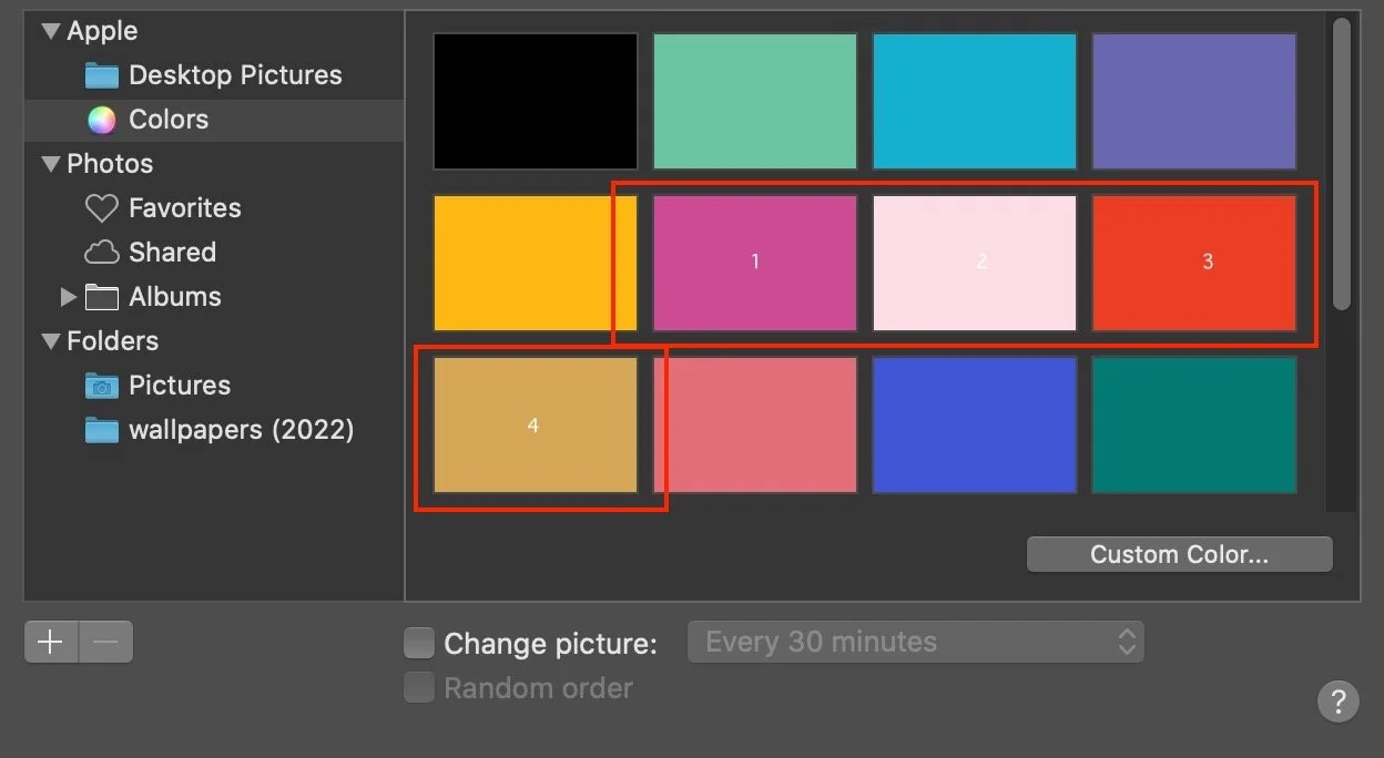
Apple’s macOS Catalina (10.15.7) offers some stock colors:
“Turquoise Green”
“Cyan”
“Blue Violet”
“Yellow”
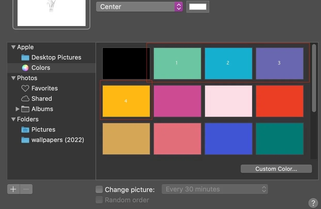
Screenshot of Apple’s default solid colors
A few words about these colors:
Converted to the HSL scale, we get
hsl(157, 43%, 59%) — green
hsl(191, 83%, 45%) — cyan
hsl(241, 31%, 55%) — violet
hsl(42, 98%, 53%) — yellow
The first number tells us the hue, or uniqueness. 157, 191, 241, and 42 indicate their hues are fairly “different” from each other (we aren’t comparing blues, yellows).
For saturation, it is remarkable the yellow is nearly fully saturated. Yellow is a difficult color to master and typically needs a lot of saturation or else it looks diluted. Cyan is also quite saturated. Green and Violet are somewhat muted, strong colors but not fully saturated.
For lightness, the range is fairly consistent between 45-59%.
Here are several images Liz took, after retouching:
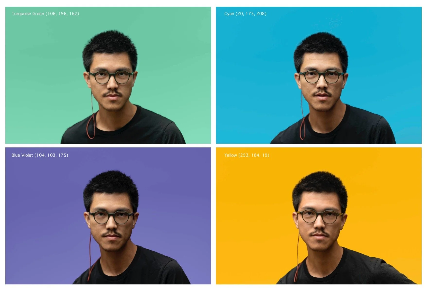
I’ve used a Savage seamless white backdrop, and several filters on the rear light.
Within a power range, I was able to find the ideal amount of rear light to “match” the Apple color:
Green —> FP 1/16 (medium)
Blue —> FP 1/32 (low)
Violet —> FP 1/32 (low)
Yellow —> FP 1/32 (low)
Key light and modifier:
• FP 1/32 + 2.3 (subject lighting)
• Softlighter 60” (light modifier, held overhead)
Camera settings:
• 1/100, f/1.4, ISO 100 (with 1.2 ND, a 4-stop filter)
Ambient light is around 150 lux (my guess).
Steps in photoshop:
Isolate subject (subject select)
Create a solid hue layer (100%) using the Apple rgb color.
set this to 100% (I want hue to fully match)
Create a solid luminosity layer (100%).
set this to 50-75% (some gradation is nice)
Use a curves layer so the middle of gradient matches the Apple color.
Refine the edges of the subject (hair, eyeglasses, etc.)

Next four Apple colors:
plum (205, 75, 147)
soft pink (252, 221, 229)
red orange (234, 62, 36)
ocher (212, 166, 86)
I noticed that changing the blend mode to “luminosity” does NOT flatten the image as the same lightness value. Help here would be appreciated. I ended up using Normal blend mode for a few of these to really flatten the backdrop.